Django IRC Contributions Graph
Django IRC D3 CONTRIBUTIONS GRAPH
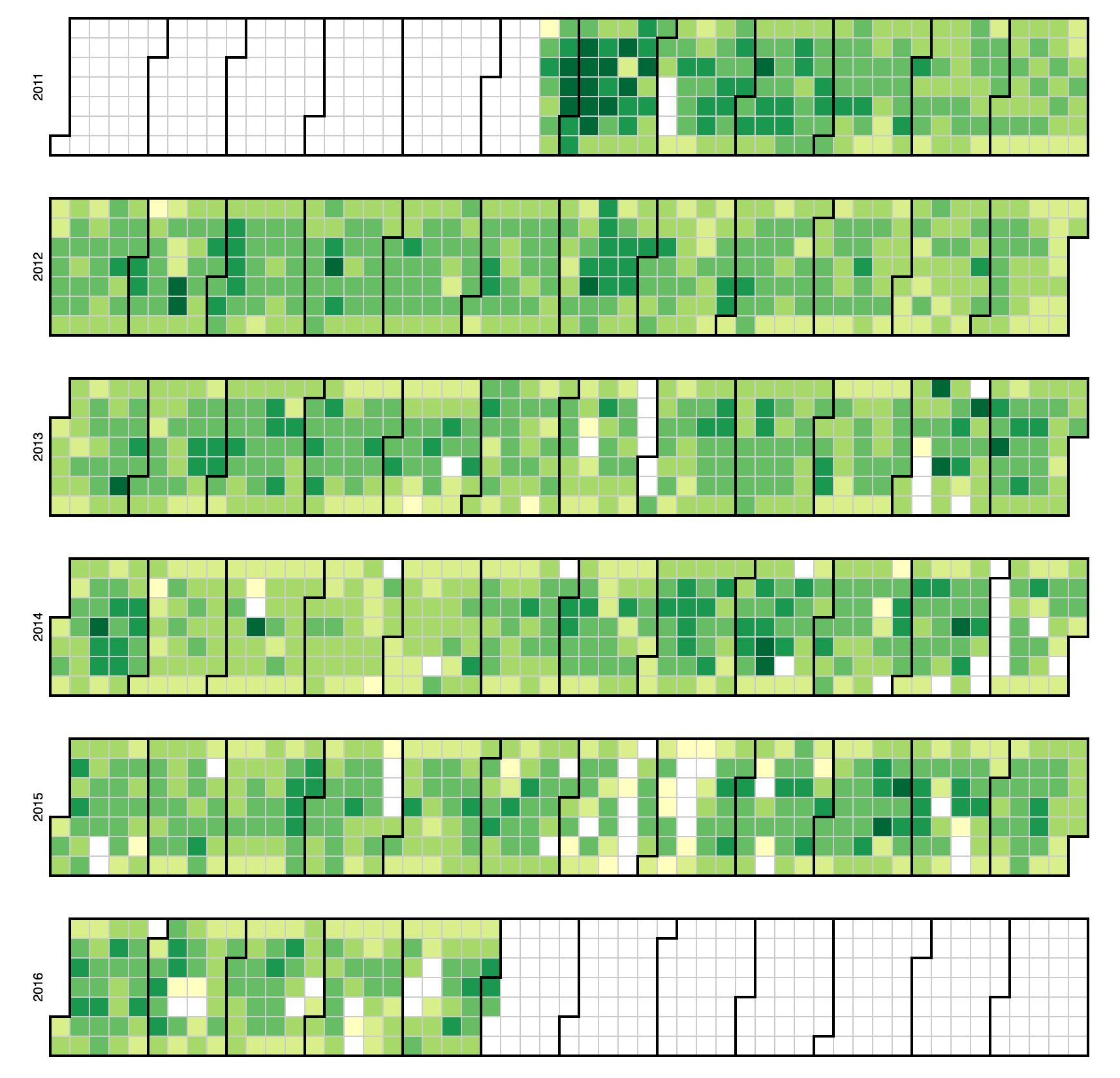
This graph represents The number of posts in the Django IRC logs. The lighter green squares represent days with less posts than the darker green squares. Months go from left to right and are separated by the darker lines. Days go by columns from left to right.
SQL Code
SELECT YEAR( date_of_entry ) , MONTH( date_of_entry ) , DAY( date_of_entry ) , COUNT( `type` )
FROM `django_irc`
WHERE TYPE = 'message'
GROUP BY 1 , 2, 3
ORDER BY YEAR( date_of_entry ) ASC, MONTH( date_of_entry ) ASC,DAY( date_of_entry ) ASC
Source code
This visualization was created using D3 and JavaScript. To view similar source code on GitHub head over to the FLOSSmole Github repositories
Want to see more examples of how to use FLOSSmole data? Examples
| Attachment | Size |
|---|---|
| 214.35 KB |
Data Resources:
- gbatchelor's blog
- Log in to post comments