some graphs
I'm experimenting with making some graphs of the data we've collected.
Here is a graph of the growth in programming languages used on Sourceforge projects from October 2004 until January 2005.

click for a full-size image
Here is a graph showing the growth in the number of projects added per month to the Sourceforge repository from November 1999 until January 2005.

click for a full-size image
Here is a graph showing growth in total numbers of Sourceforge projects, by month, from November 1999 until January 2005.
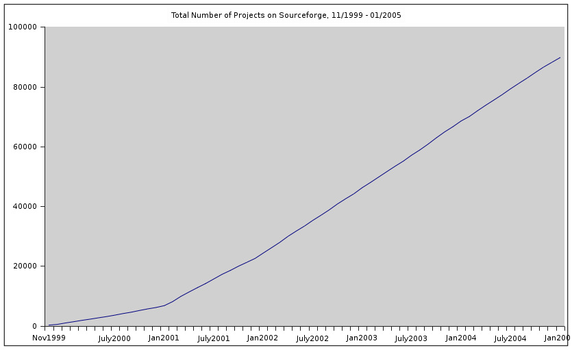
click for a full-size image
Here is a pie chart showing the different license types and how many Sourceforge projects use each one as of January 2005. (This chart only includes license types with more than 100 projects.)

click for a full-size image
Here is a graph of the growth in programming languages used on Sourceforge projects from October 2004 until January 2005.
click for a full-size image
Here is a graph showing the growth in the number of projects added per month to the Sourceforge repository from November 1999 until January 2005.
click for a full-size image
Here is a graph showing growth in total numbers of Sourceforge projects, by month, from November 1999 until January 2005.
click for a full-size image
Here is a pie chart showing the different license types and how many Sourceforge projects use each one as of January 2005. (This chart only includes license types with more than 100 projects.)
click for a full-size image
- megan's blog
- Log in to post comments
Comments
Interesting. I had expected
Interesting. I had expected an exponential growth, at least around 2002. Instead it looks as though it was only exponential for about 2 months in early 2001.